yPage
Description
The yPage is a container element to organize and hold elements.
Some use-cases for the yPage are:
Basic Structure
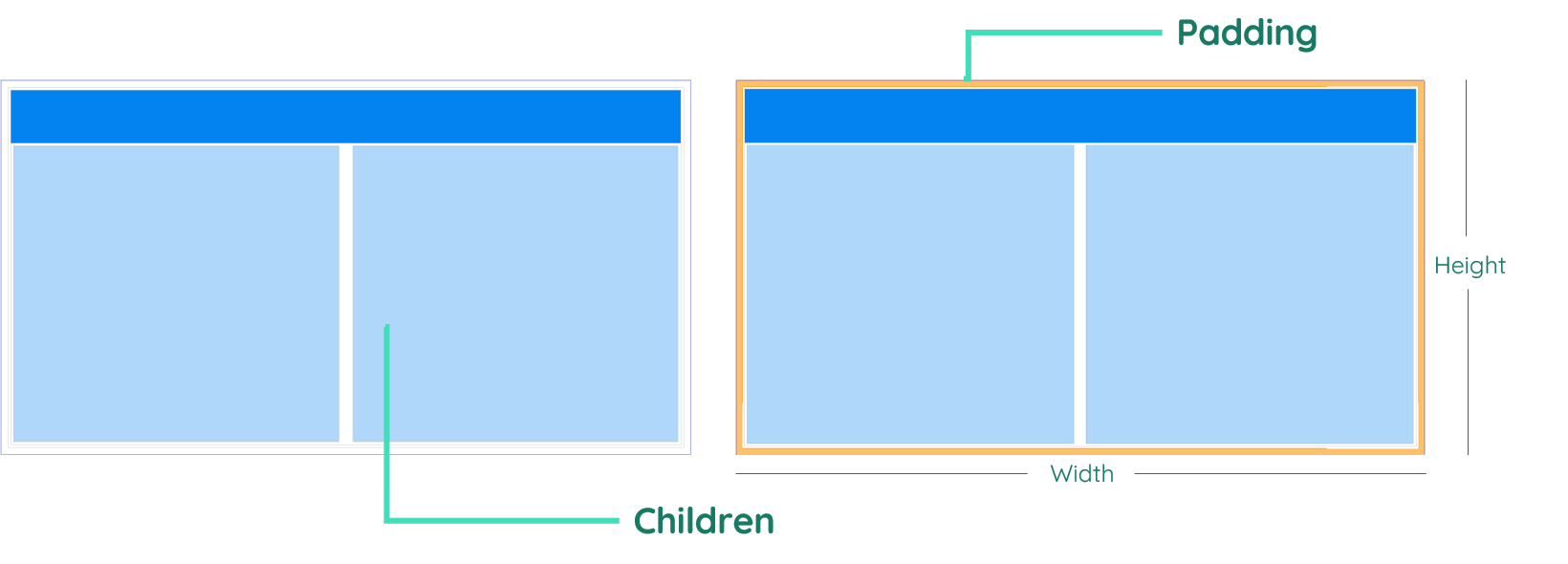
The basic structure of the yPage shall be explained in the following. For the general structure of a yComponent please visit the YBase-components basic-structure.
Properties
Through its various properties the yPage can be configured to suit your needs. The display below provides you with an overview of all the yPage properties.
Properties can be changed directly through three methods:
- Inside the Toolbar, which is positioned in your workarea next to your component right where you need it. It shows the most important properties, thus providing a fast and efficient way to configure your component in the most basic way.
- It may also occur in the Toolbar Extension, which is a seamless extension accesible as a dropdown item of the Toolbar. It extends the functionality of the Toolbar by providing advanced pickers for the most used properties.
- Inside the Detail Panel, which is located in the righthand drawer. Every property of a component can be configured here.
- Generic
- Style
- Events
METAread more
The identifier of the component that is unique within a page.
The type of the component. For this component it is -page.
The custom name of the component. It serves for better identification of the component.
The custom version of the Page-component. This can be used to ensure that all components work well together.
The CoreTheme, which will be apllied to the Page. For further information on themes visit the themes page.
The subtheme subordinated to the previously specified CoreTheme, which will be apllied to the Page. For further information on themes visit the themes page.
The group theme is a further variation of the subtheme which is specified especially for variations of a component inside the subtheme. For further information on themes visit the Theme-Manager page.
DISPLAYread more
This property specifies the display behavior of the component. This can be be set to:
- none
- block
- flex
- inline
This property specifies the type of positioning method used for the component. This can be be set to:
- static
- relative
- absolute
- sticky
- fixed
This property can toggle the visibility of the component. The two modes are completely hidden and fully shown.
SIZEread more
The minimum value for the width of the component. This can be set in:
- px
- pt
- em
- vw
- vh
- %
The minimum value for the height of the component. This can be set in:
- px
- pt
- em
- vw
- vh
- %
The value for the width of the component. This can be set in:
- px
- pt
- em
- vw
- vh
- %
- auto
The value for the height of the component. This can be set in:
- px
- pt
- em
- vw
- vh
- %
- auto
The maximum value for the width of the component. This can be set in:
- px
- pt
- em
- vw
- vh
- %
- none
The maximum value for the height of the component. This can be set in:
- px
- pt
- em
- vw
- vh
- %
- none
The flex property sets the length on flexible items. This sets the value in n-fold shares extrapolated to all other components with the flex display within the same container.
PLACEMENTread more
This property creates a space around the component, outside of the top border. This can be set in percent or pixels.
This property creates a space around the component, outside of the right border. This can be set in percent or pixels.
This property creates a space around the component, outside of the bottom border. This can be set in percent or pixels.
This property creates a space around the component, outside of the left border. This can be set in percent or pixels.
This property creates a space within the component, inside of the top border. This can be set in percent or pixels.
This property creates a space within the component, inside of the right border. This can be set in percent or pixels.
This property creates a space within the component, inside of the bottom border. This can be set in percent or pixels.
This property creates a space within the component, inside of the top border. This can be set in percent or pixels.
BACKGROUNDread more
The color of the background. This can be set as a color from a palette or a custom hex color.
The url to the source of the file to be set as the background. This can be set to a text containing a valid url path. The path should not be to your local files (starting with e.g. C:/...), but instead to the web (starting with e.g. https://www....).
The size of the background inside of the Page-component. This can be set to:
- auto
- cover
- contain
The position of the background inside of the Page-component. This can be set to:
- none
- center
- left
- right
- top
- bottom
- inherit
This property specifies if the background should be repeated.
BORDERread more
The color of the top border. This can be set as a color from a palette or a custom hex color.
The style of the top border. This can be be set to:
- solid
- dotted
- dashed
- none
The width of the top border. This can be set in percent or pixels.
The color of the right border. This can be set as a color from a palette or a custom hex color.
The style of the right border. This can be be set to:
- solid
- dotted
- dashed
- none
The width of the right border. This can be set in percent or pixels.
The color of the bottom border. This can be set as a color from a palette or a custom hex color.
The style of the bottom border. This can be be set to:
- solid
- dotted
- dashed
- none
The width of the bottom border. This can be set in percent or pixels.
The color of the left border. This can be set as a color from a palette or a custom hex color.
The style of the left border. This can be be set to:
- solid
- dotted
- dashed
- none
The width of the left border. This can be set in percent or pixels.
The radius of the corners of all the borders. This can be set in percent or pixels.
SHADOWread more
The shadow of the component. This is set by the 4 sub-properties x, y, blur and spread of the shadow-property, which can be further read about in the shadow-property section.
OPACITYread more
The opacity of all colored parts of the component. This value is set in percent.
ALIGNMENTread more
This property specifies whether the flexible items in the Page-component should wrap or not.
The direction in which the flexible items inside the Page-component should align.
The justification of the flexible Page-container's items when the items do not use all available space on the the main-axis (horizontally).
The default alignment for items inside the flexible Page-container.
The justification of the flexible Page-container's items when the items do not use all available space on the main-axis (vertically).
The default alignment for content inside the flexible Page-container.
This property specifies the behavior, when content inside the Page-component is wider than its parent(vertically). This can be set to:
- visible
- hidden
- scroll
- auto
This property specifies the behavior, when content inside the Page-component is higher than its parent(horizontally). This can be set to:
- visible
- hidden
- scroll
- auto
This property specifies, whether the scrollbar should be displayed or not, while keeping scrollability.
LIFECYCLEread more
This specifies the function to be called, when the Page is initialized.
Usage
In this section you will find a collection of application scenarios and examples that illustrate how to leverage the yPage in ways that deviate from its standard behavior, as defined by yBase. This section aims to inspire and guide you through various possibilities, helping you to implement more complex or unique functionalities tailored to your specific needs. General properties that are universally applicable can be found in the yBase usage section.
Background

- Cover
- Repeat
Alignment
This section shows the visualization of example related to the flexbox system.
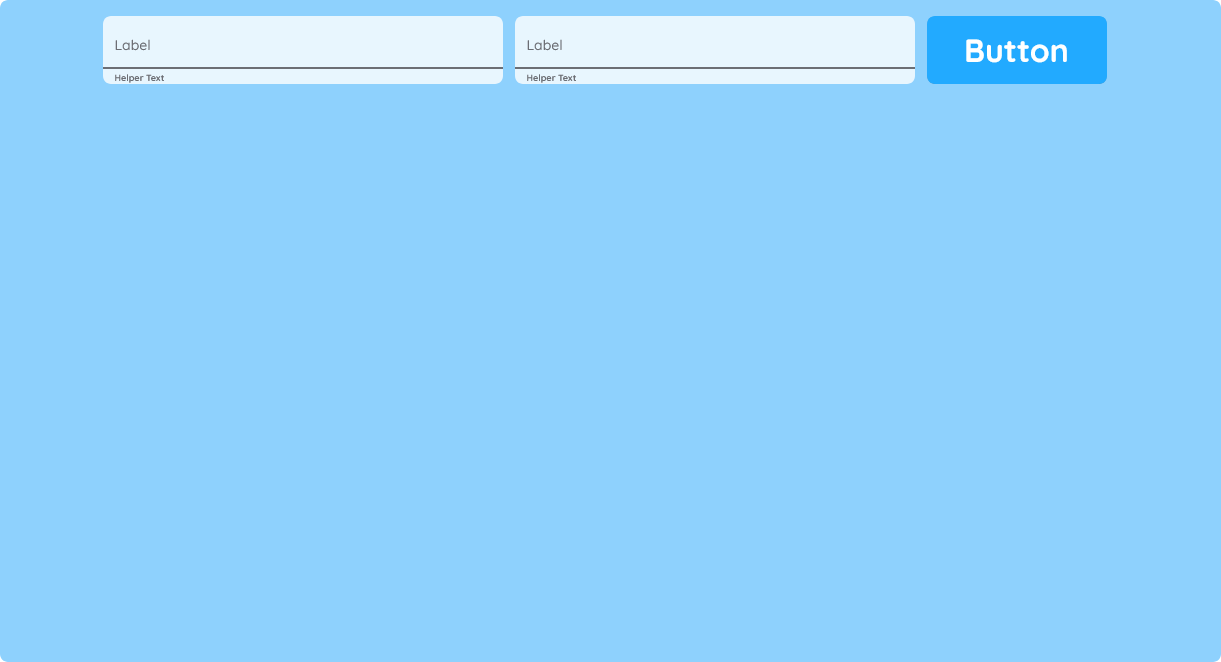
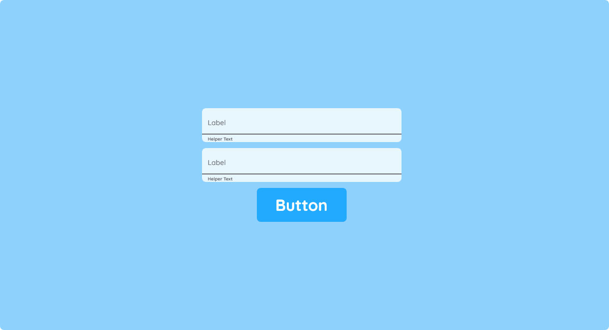

- Row
- Column
- Wrap
If the content exceeds the parent element itself, a scrollbar will appear. When needed, this scrollbar can be removed while keeping scrollability, when toggling the property show-scrollbar to false.
Theming
How to:
You can use yPage to dynamically theme the content inside—for example, by switching styles based on a value stored in a Clipboard.
This example requires two different SubThemes to exist inside your CoreTheme.
- Add a yToggle.
- Navigate to Clipboards and create a new Clipboard.
- Add a new data property, change its value type to boolean, and name it useDarkTheme.
- Create a SourceLink and connect it to the yToggle, resulting in a SourceLink like:
y-page:1:y-toggle:2:value. - Go back to the Ui Designer and select the page.
- Open Events in the Detail Panel and edit
EvtInit. - Insert the code snippet below and save your changes.
Code example:
In this example, the active theme is chosen by reading a boolean property from a Clipboard.
// function onPage_1_EvtInit (apiObject, component, eventData) {

const useDarkTheme = await apiObject.Clipboards.propertyRead(0, "useDarkTheme");

if (useDarkTheme) {
  component.set("generic", "meta", "SubTheme", "[insert subtheme name here]");
} else {
  component.set("generic", "meta", "SubTheme", "[insert subtheme name here]");
}

// }
Conditional Loading
How to:
You can use the yPage to change the appearance of subComponents, based on a state.
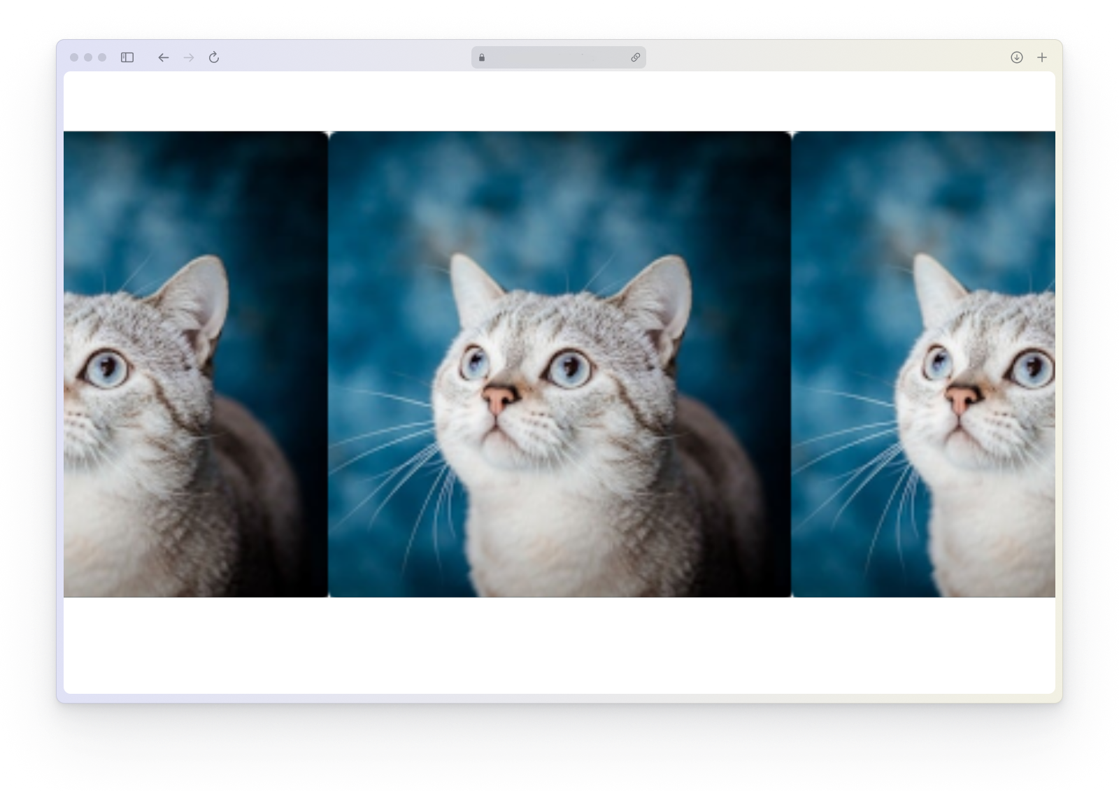
- Add two yImage components and configure them as you wish.
- Select the current page again.
- Navigate to Events inside the Detail Panel and modify
EvtInit. - Insert the code snippet down below.
Code example:
In this example, the appearance of an image is adjusted based on the role of the currently logged-in user.
When you start the project in Preview, the yImage with ID 2 is shown; in production runtime, the yImage with ID 1 is displayed instead.
// function onPage_1_EvtInit (apiObject, component, eventData) {

if (apiObject.user.roleId === "2") {
  // may see the image with all developers
  const image = apiObject.ui.getObject(2, "y-image", "y-page", 1);

  image.set("style", "opacity", "opacity__normal", 1.0);
} else {
  // can just see the image with customers
  const image = apiObject.ui.getObject(3, "y-image", "y-page", 1);

  image.set("style", "opacity", "opacity__normal", 1.0);
}

// }
Fetching Data from an API
How to:
You can use yPage to fetch data from an API and process it.
- Create a new ySelectionPicker and style it as needed.
- Select your page again.
- Go to Events in the Detail Panel and edit
EvtInit. - Insert the code snippet below to fetch all available country codes and load them into the ySelectionPicker as an
OptionListValue[].
Code example:
In this example, the user fetches data from the REST Countries API and uses it to build a list of country codes.
// async function onPage_1_EvtInit (apiObject, component, eventData) {

// Define the URL of the API that returns country codes
const apiUrl = "https://restcountries.com/v3.1/all";

try {
  // Fetch data from the API
  const response = await fetch(apiUrl);

  // Check if the response is ok (status code 200-299)
  if (!response.ok) {
    throw new Error(`HTTP error! Status: ${response.status}`);
  }

  // Parse the JSON data from the response
  const data = await response.json();

  // Extract the country codes from the data
  const countryCodes = data.map(
    (country) =>
      new apiObject.types.optionListValue(country.cca2, country.name.common)
  );

  const listPicker = apiObject.ui.getObject(
    4,
    "y-selection-picker",
    "y-page",
    1
  );

  listPicker.set("style", "list", "optionList", countryCodes);
} catch (error) {
  // Log any errors that occur during the fetch
  console.error("Error fetching country codes:", error);
}

// }